Next.js 製サイトに AMP を適用する
introduction
Too Long, Didn’t Read
[slug].tsx で getStaticPaths などを使った dynamic route と、Hybrid AMP を併用することは現状難しいことが判明した。色々考えた結果、https://oriverk.dev の方はコードの自由度を保つため、AMP 技術を組み込まないことにした。その他の playground や趣味ブログで使っていきたい。
AMP(Accelerated Mobile Pages)
Google と Twitter による開発のキャッシュ等によるモバイル表示の高速化技術。AMP Websites, Stories, Ads, Email の 4 つがあり、検索ページでは AMP 対応サイトは雷⚡アイコンが表示される。今回は AMP Websites を利用する。
reference: amp.dev - AMP HTML 仕様
<!doctype html><html ⚡> <head> <meta charset="utf-8"> <title>Sample document</title> <link rel="canonical" href="./regular-html-version.html"> <meta name="viewport" content="width=device-width,minimum-scale=1,initial-scale=1"> <style amp-custom>h1 {color: red}</style> <script type="application/ld+json"> { "@context": "http://schema.org", "@type": "NewsArticle", "headline": "Article headline", "image": [ "thumbnail1.jpg" ], "datePublished": "2015-02-05T08:00:00+08:00" } </script> <script async custom-element="amp-carousel" src="https://cdn.ampproject.org/v0/amp-carousel-0.1.js"></script> <script async custom-element="amp-ad" src="https://cdn.ampproject.org/v0/amp-ad-0.1.js"></script> <style amp-boilerplate>body{-webkit-animation:-amp-start 8s steps(1,end) 0s 1 normal both;-moz-animation:-amp-start 8s steps(1,end) 0s 1 normal both;-ms-animation:-amp-start 8s steps(1,end) 0s 1 normal both;animation:-amp-start 8s steps(1,end) 0s 1 normal both}@-webkit-keyframes -amp-start{from{visibility:hidden}to{visibility:visible}}@-moz-keyframes -amp-start{from{visibility:hidden}to{visibility:visible}}@-ms-keyframes -amp-start{from{visibility:hidden}to{visibility:visible}}@-o-keyframes -amp-start{from{visibility:hidden}to{visibility:visible}}@keyframes -amp-start{from{visibility:hidden}to{visibility:visible}}</style><noscript><style amp-boilerplate>body{-webkit-animation:none;-moz-animation:none;-ms-animation:none;animation:none}</style></noscript> <script async src="https://cdn.ampproject.org/v0.js"></script> </head> <body> <h1>Sample document</h1> <p>Some text<amp-img src=sample.jpg width=300 height=300></amp-img></p> </body></html>Next.js と AMP
Next.js は AMP に対応していて、AMP のみの生成と AMP と従来の HTML ページの生成を制御できる。export const config = { amp: true } または ‘hybrid’としておけば、amp コンポーネント用の script などの記述が自動で挿入される。
AMP First Page
- nextjs と react client side のランタイムを持たない
- amp optimizer で自動最適化
- ユーザー用の最適化済みページと、検索エンジン用のインデックス可能な非最適化ページを生成
export const config = { amp: true }const Component = () => { return <h3>My AMP About Page!</h3>}export default ComponentHybrid AMP Page
- 従来の HTML ページと AMP ページが生成される
- AMP ページは amp-optimizer により最適化されているため、検索エンジンによるインデックスが可能
なお、amp-only と hybrid の 2 つのモードの区別には、useAmp() という React Hooks が用いられる。前者の時は true を、後者の時は false を返す。
import { useAmp } from "next/amp";
export const config = { amp: "hybrid" };const Component = () => { const isAmp = useAmp(); return ( <> {isAmp ? ( <amp-img layout="responsive" width="300" height="300" src="/my-img.jpg" alt="a cool image" /> ) : ( <img width="300" height="300" src="/my-img.jpg" alt="a cool image" /> )} </> );};export default Component;Main
修正する必要がある箇所
_document.jsx内の gtag の変更- image の取り扱い
- amp モード時は
amp-imgを使用する必要がある
- amp モード時は
- swipeable な side-bar
- サイト内検索用の algolia
onclickで開閉するアイコンリンク群amp-state辺りでイケるかな?
setup amp-validator
google web store - AMP Validator を使用する。
modify components for amp
style amp-custom
css ライブラリには styled-jsx を使ってます。非 amp の時の様に <style jsx>{ amp-img { width: 100%; } }</style> の様に書けば、自動的に <style amp-custom> に変換される。
amp.d.ts
AMPはtypescript用の組込型が無い ので、自分で amp.d.ts を作る必要がある。実際に <amp-img> とすると Property 'amp-img' does not exist on type 'JSX.IntrinsicElements'. と出る。
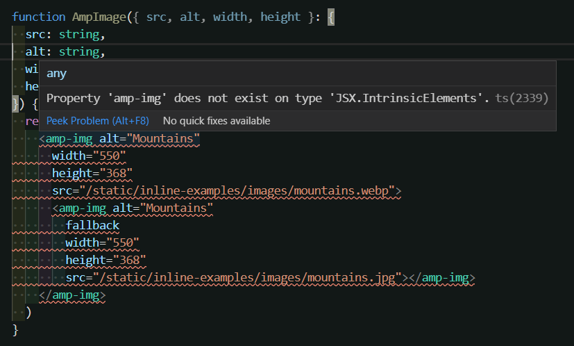
custom types の追加には stack overflow を参照する様にと Next.js 公式ドキュメントにある。
取り敢えず、amp-image を対応してみる。
declare namespace JSX { type ReactAmp = React.DetailedHTMLProps< React.HTMLAttributes<HTMLElement>, HTMLElement >;
interface AmpImg extends ReactAmp { children?: React.ReactNode; alt?: string; attribution?: string; src?: string; srcset?: string; width?: string; height?: string; sizes?: string; heights?: string; layout?: "fill" | "fixed" | "fixed-height" | "flex-item" | "intrinsic" | "nodisplay" | "responsive"; fallback?: "";
on?: string; // amp-image-lightbox role?: string; tabindex?: string; }
interface IntrinsicElements { "amp-img": AmpImg; }}- 一部参考にしたもの
- とあるgist
- とあるamp.d.ts を見かけた
amp-img
以前に画像最適化した際 に使った next-optimized-images を今回も併用した。
また fallback にはエラー回避のために、空文字を渡しておいた。これは Reactの仕様に起因 していて、React issue#9230 が一番参考になった。これによる Next.js 側の issue だと、#8861、#10000、#12708 がある。attribute が違うだけで、原因は全部同じようだ。
const AmpImg = () => { // below is related to next-optimized-images const image = require("@public/assets/shirase.jpg?resize"); const webp = require("@public/assets/shirase.jpg?resize&format=webp"); return ( <amp-img alt="shirase" layout="responsive" width={webp.width} height={webp.height} src={webp.src} srcset={webp.srcSet} > <amp-img fallback="" alt="shirase" width={image.width} height={image.height} src={image.src} srcset={image.srcSet} ></amp-img> </amp-img> );};amp-image-lightbox
画像ポップアップの lightbox。amp-image-lightbox を書き加え、amp-img に on 属性などを書き足すだけで動く。また id さえ合致して置けば、1 ページに 1 つの amp-image-lightbox で動く。
const AmpImageLightbox = () => { const shirase = require("@public/assets/shirase.jpg?resize"); const pikachu = require("@public/assets/pikachu.jpg?resize"); return ( <amp-image-lightbox id="lightbox1" layout="nodisplay" /> <figure> <amp-img on="tap:lightbox1" role="button" tabindex="0" layout="responsive" className="shirase" width={shirase.width} height={shirase.height} src={shirase.src} ></amp-img> <figcaption>JSDF Antarctic IceBreaker Shirase</figcaption> </figure> <div> <amp-img on="tap:lightbox1" role="button" tabindex="0" layout="responsive" className="pikachu" aria-describedby="imageDescription" width={pikachu.width} height={pikachu.height} src={pikachu.src} ></amp-img> <div id="imageDescription">A wild pikachu in WA.</div> </div> );};amp-image-slider
中央のスライダーを動かして、画像を比較できる。個人的には Photoshop での画像修正のビフォーアフターを見せる箇所の奴。画像ラベルには通常の div 要素にはない属性を必要とし、.d.ts で拡張することにした。
import { AriaAttributes, DOMAttributes } from "react";declare module "react" { interface HTMLAttributes<T> extends AriaAttributes, DOMAttributes<T> { first?: ""; second?: ""; }}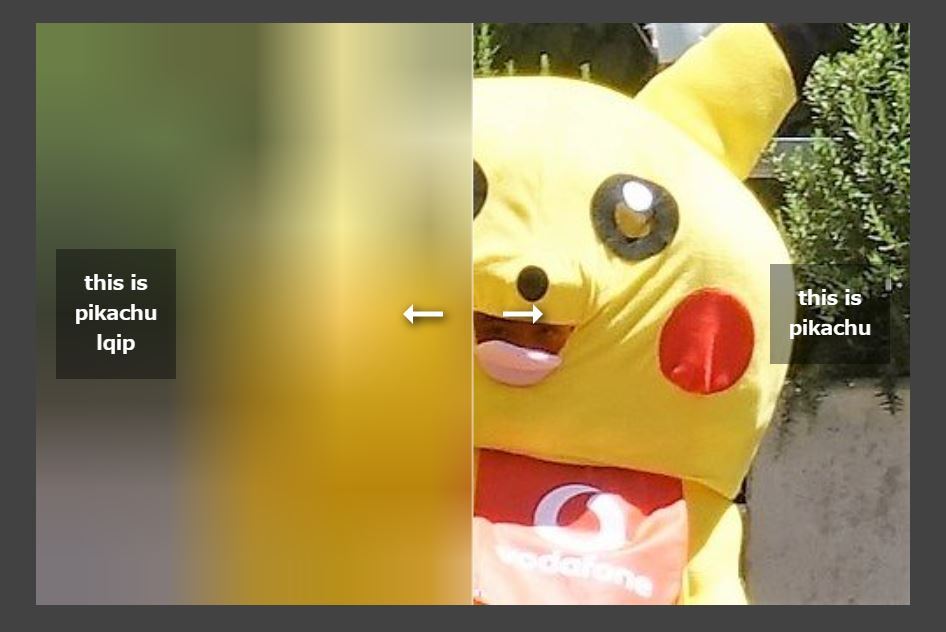
const AmpImageSlider = () => { const lqip = require("@public/assets/pikachu.jpg?lqip"); const pikachu = require("@public/assets/pikachu.jpg?resize"); return ( <> <amp-image-slider layout="responsive" width="100" height="200"> <amp-img src={lqip.src} alt="lqip" width={pikachu.width} height={pikachu.height} ></amp-img> <amp-img src={pikachu.src} alt="pikachu" width={pikachu.width} height={pikachu.height} ></amp-img> <div first="">this is pikachu lqip</div> <div second="">this is pikachu</div> </amp-image-slider> </> );};amp-carousel
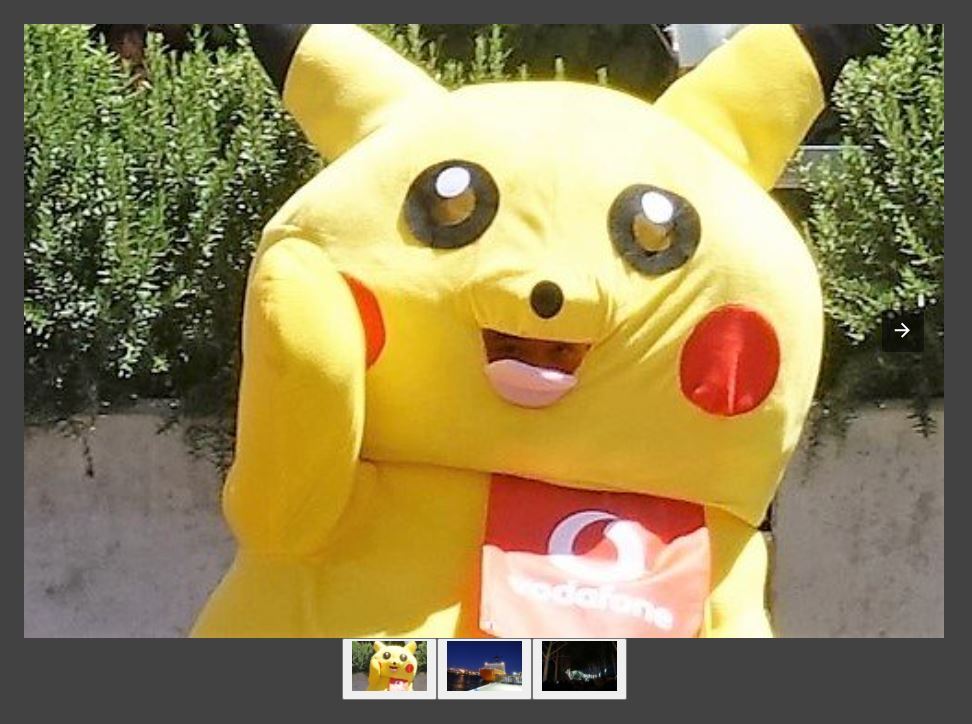
amp-carousel も実際に触ってみたが、controls や autoplay、loop に空文字を渡せるように.d.ts に定義する以外は真新しいものは無かったので割愛。ただ、amp-carousel に指定できる属性が多く、属性だけで見た目や動作などを大きく変えられるので、弄って遊ぶだけでも面白かった。
others
[TOC]
Last
References
amp 化する際に、読んだり参考にしたもの。
- amp.dev
- Vercel Next.js - AMP Support
- mizchi.dev - next.js の AMP mode を使って静的サイトを作る
- こちらのサイトは Full AMP で実装
- Recruit - モダンなWebフロントエンドの技術とAMP
- Next.js と AMP の話
- 実践 Web Stories(旧 AMP Stories)
- TypeScript で書く React コンポーネントを基礎から理解する
- How to add attributes to HTML element in TypeScript
- 既存の HTML の拡張の仕方