Next.js: next-optimized-images を使った画像自動最適化
※ nextjs 画像最適化のための next/image の Image component が登場して以来、該当ライブラリは開発を停止しています。
今回は画像を webp 等に変換し、レスポンシブや Low Quality Image Placeholder に対応するといった、画像最適化について書く。
next-optimized-images
以降、next-optimized-images を”next-opti”と略す
画像の最適化方法はタスクランナーのなかで画像圧縮プラグインを利用するなど複数あるが、今回は cyrilwanner/next-optimized-images を利用する。
environment
- “node”: “v14.5.0”
- “react”: “16.13.1”
- “next”: “9.3.5”,
- “next-optimized-images”: “^2.6.2”
canary版のv3 もある。
setup
yarn add next-optimized-imagesこのパッケージに加え、自分が必要な機能にあったプラグインを入れる必要がある。取り敢えず、MozJPEG と OptiPNG に変換するプラグインを入れておく。
yarn add npm imagemin-mozjpeg imagemin-optipngConfig
パッケージの方に 各プラグインのデフォルト設定値 が含まれているが、next.config.js のなかで設定を変更できる。下は自分のもので書きやすくするために、next-compose-plugins を入れている。
const withPlugins = require('next-compose-plugins')const optimizedImages = require('next-optimized-images')
const nextOptimizedImagesConfig = { imagesFolder: 'images', imagesName: '[name]-[hash].[ext]', handleImages: ['jpeg', 'png', 'webp'], removeOriginalExtension: true, optimizeImages: process.env.MODE_ENV !== 'development', optimizeImagesInDev: false, mozjpeg: { quality: 85, }, optipng: { optimizationLevel: 3, }, webp: { preset: 'default', quality: 85,},}
module.exports = withPlugins( [ [ optimizedImages, nextOptimizedImagesConfig ], ],)usage
href (image path)
next.js.config にパスのエイリアスを設定し、 <img src={require(../../example.jpg)} /> の様に指定する。
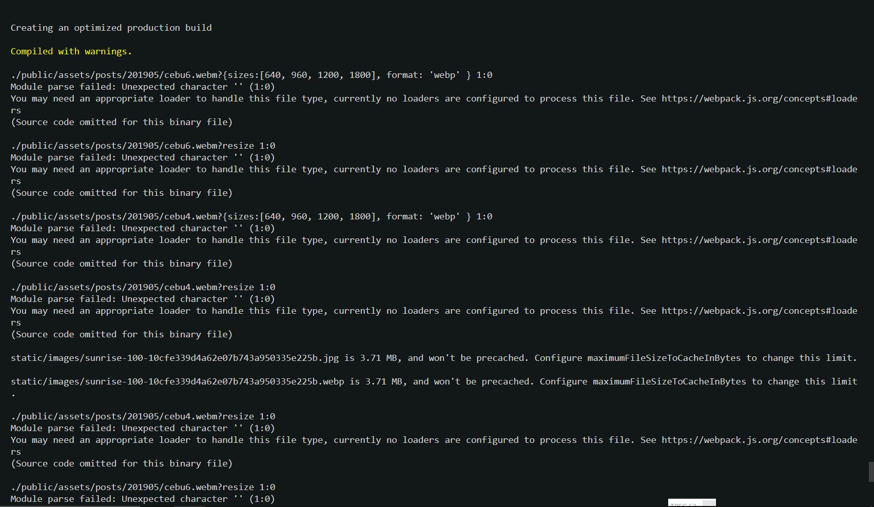
原因は webpack にある模様
- references:
const { resolve } = require('path')
const nextConfig = { webpack: (config) => { config.resolve.alias['@public/assets'] = resolve(__dirname, 'public/assets') return config },}
// ...module.exports = withPlugins([ ... ], nextConfig)convert to webp
yarn add webp-loaderまた、imagemin-mozjpeg や imagemin-optipng 等は href={require('../example.jpg')} の様にすればプラグインが適用化される。が、その他は query params で指定する必要がある。
export default () => ( <picture> <source srcSet={require('./images/my-image.jpg?webp')} type="image/webp" /> <img src={require('./images/my-image.jpg')} /> </picture>)responsive image
yarn add responsive-loader sharpresize を可能にする responsive-loarder は jimp と sharp が別に必要だが、jimp は README.md(↓)でディスられてる位なので、sharp を使う。
Requires the optional package responsive-loader (npm install responsive-loader) and either jimp (node implementation, slower) or sharp (binary, faster)
画像をリンクする際は require('./images/my-image.jpg?resize&sizes[]=300&sizes[]=600&sizes[]=1000') の様に指定できる。が、下の様に responsive:sized:[] と画像サイズ幅を global resize property として指定できる。
// ...const nextOptimizedImagesConfig = {// ... responsive: { adapter: require('responsive-loader/sharp'), sizes: [640, 960, 1200, 1800], disable: process.env.MODE_ENV === 'development' },// ...}
module.exports = withPlugins( [[ optimizedImages, nextOptimizedImagesConfig ],], nextConfig)サンプルコード ※ require 内での sizes 指定方法は下の様に複数ある。
// どれでも動くconst multi = require(`../../public/cat1200x.jpg?resize&sizes:[640,960,1200,1800]`)// const multi = require('../../public/cat1200x.jpg?resize&sizes[]=640&sizes[]=960&sizes[]=1200&sizes=[1800]')// const multi = require('../../public/cat1200x.jpg?resize&sizes[]=640,sizes[]=960,sizes[]=1200,sizes[]=1900')
export default () => ( <img srcSet={multi.srcSet} src={multi.src} width={multi.width} height={multi.height}/>);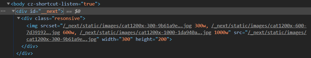
webp-loader と responsive-loader
現状の next-opti は webp-loader と responsive-loader を example.jpg?webp?resize の様に連ねて書くと動かない。根本的な解決は next-opti v3 で解決する模様。
2 つを同時に動かすサンプルコード
export default function () { const multiWebp = require(`../../public/cat1200x.jpg?resize&sizes:[640,960,1200,1800]&format=webp`) return ( <img srcSet={multiWebp.srcSet} src={multiWebp.src} width={multiWebp.width} height={multiWebp.height} /> )}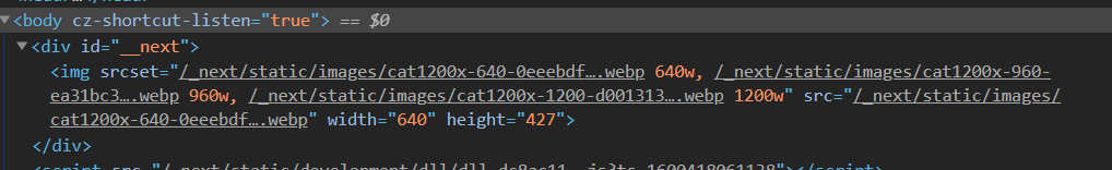
自分の場合
next.Config.js のなかで、responsive:{sizes: [640, 960, 1200, 1800],} としてあるので component を作って利用している。
export function OptimizedImages({ src, alt, imgStyle }) { const multi = require(`@public/assets/${src}?resize`) const multiWebp = require(`@public/assets/${src}?resize&format=webp`)
return ( <React.Fragment> <picture> <source srcSet={responsiveImageWebp.srcSet} type='image/webp' /> <img src={responsiveImage.src} srcSet={responsiveImage.srcSet} width={responsiveImage.width} height={responsiveImage.height} /> </picture> </React.Fragment> )}Low Qualy Image Placeholder
yarn add lqip-loaderexport default function () { return ( <img src={require('../../public/shirase.jpg?lqip')} /> <img src={require('../../public/shirase.jpg')} /> )}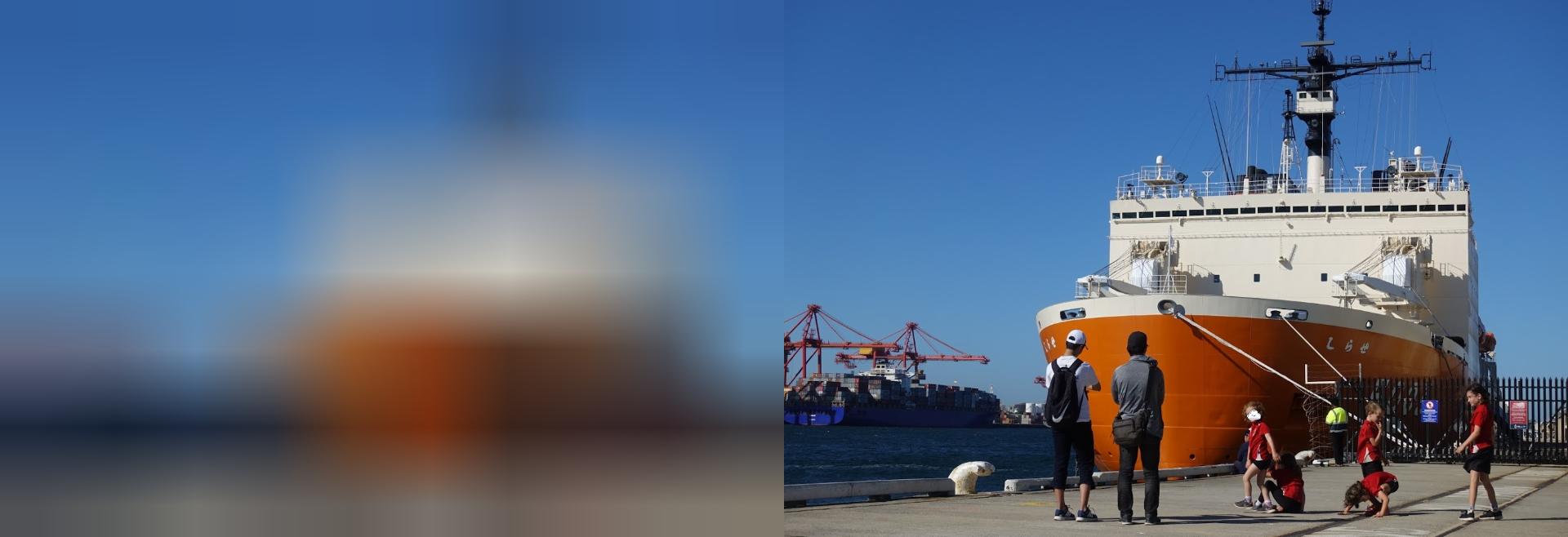
lqip(左)の方は 10×7px の 925b に縮小されている。更に filter:blur(10px) 辺りを掛けると更に良さそう。
lqip-loaderを使ったprogressive image loading の実装
medium 風の画像表示をやってみる。まずは useState を使って、lazy load の画像が load されたら、lqpi の opacity を 0 にする。
import React, { useState } from 'react'
export default function () { const [imageLoaded, setImageLoaded] = useState(false) return ( <> <div> <img src={require(`../../public/shirase.jpg?lqip`)} className='lqip' style={{opacity: imageLoaded ? 0 : 1}} /> <img src={require(`../../public/shirase.jpg`)} onLoad={() => setImageLoaded(true)} loading='lazy' /> </div> <style jsx>{` div { position: relative; }
img { width: 50%; height: auto; } .lqip { position: absolute; top: 0; left: 0; z-index: 10; filter: blur(10px); transition: opacity 500ms cubic-bezier(0.4, 0, 1, 1); } `}</style> </> )}